
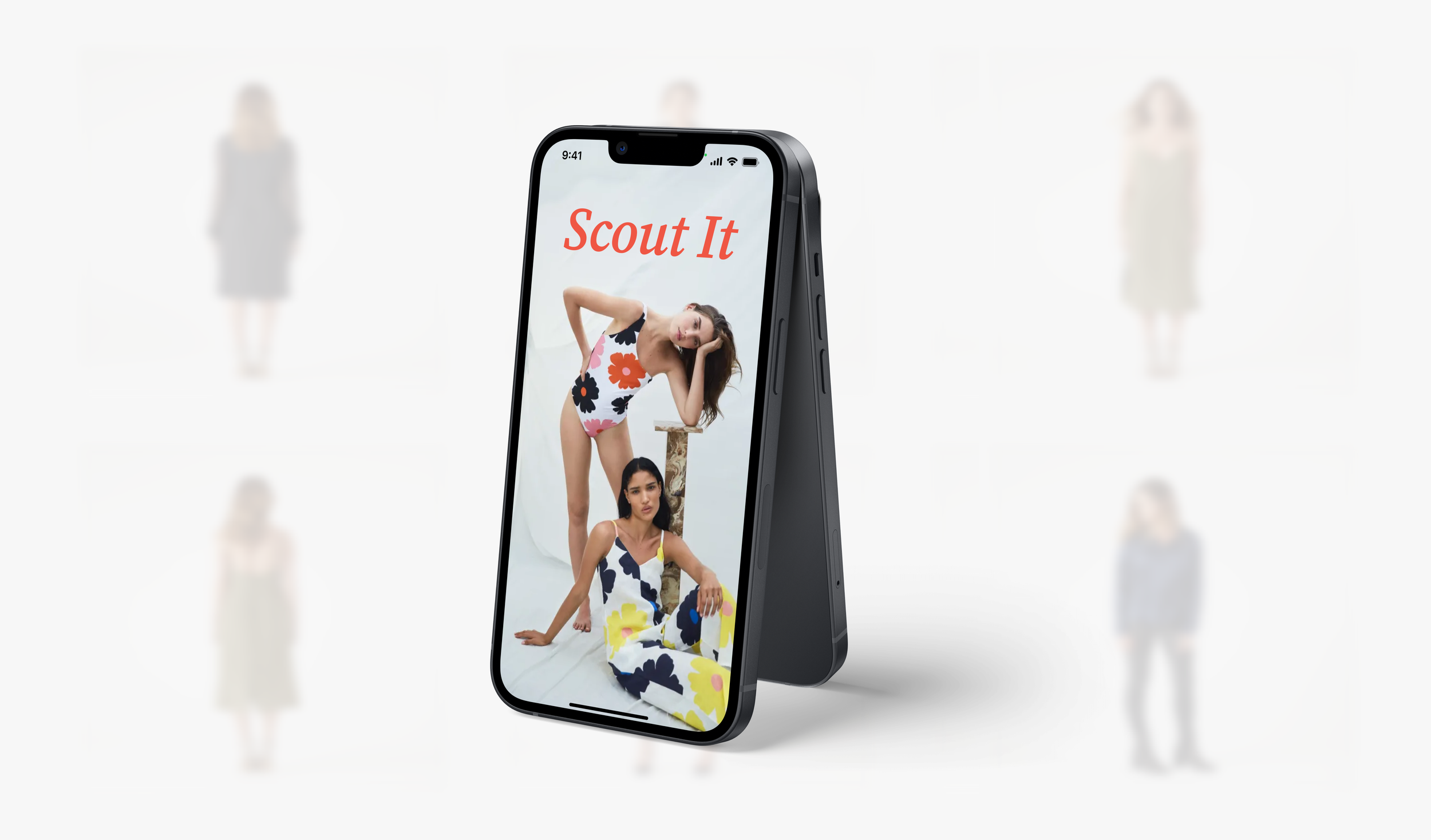
Scout It
Sourcing Secondhand
Fashion is the second most polluting industry in the world after oil. The secondhand clothing market addresses this problem by promoting people to shop others’ closets.
Scout It is an impactful shopping app that provides clear, organized results in one place while also promoting secondhand shopping.
Description: Identified an opportunity to simplify the resale shopping experience.
Role: UX/UI Designer and Researcher
Duration: 8 weeks
Software: Figma, Miro, Photoshop
Secondhand shopping is overwhelming
The Problem
Searching for secondhand clothing online can be tedious and time consuming due to the overwhelming number of available resell apps. How might we encourage more people to shop secondhand?
The Solution
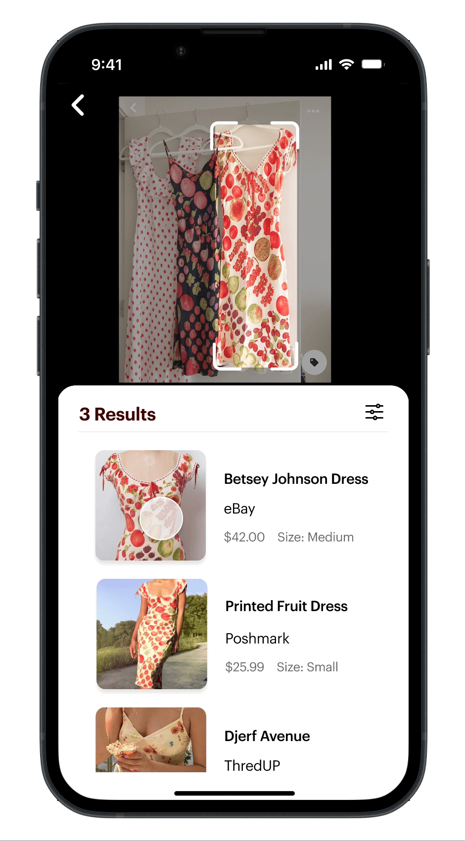
A specific item finder
Scout It‘s mission is to promote a secondhand shopping experience that is painless and convenient. This can be achieved through a reverse image search where Scout It auto populates relevant search results.
Finding items is no longer a pain.
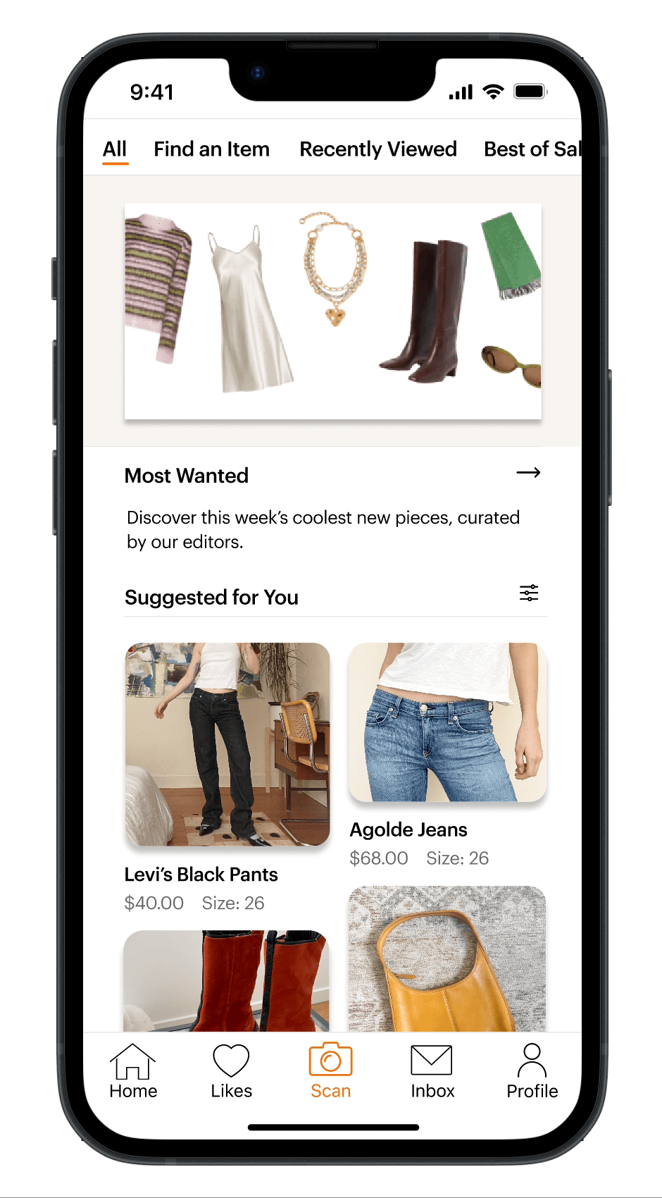
The Main Features
Shorten time to locate an item by simply snapping or uploading a picture of the desired clothing.
Relevant items will aggregate from a reverse image search. Additional filters and key words (i.e. desired size) can be added to narrow the search.
Checkout Seamlessly.
Existing users can immediately checkout with a “swipe to purchase” button, and their information will be autofilled for a faster checkout process.

Competitive Analysis
Analyzing Successful Apps
I conducted a comprehensive review of direct and indirect competitors to compare their features and layouts to learn what makes a great mobile app. I adopted some of these features into the Scout It design since they successfully influence user behaviors.
Interaction Models
Scrolling Behavior
Pinterest provides easy navigation and discovery of new creators on feed. I modeled Scout It’s homepage after Pinterest so users can easily scroll through suggested items and toggle between pages.

The Magic of AI
Poshmark (secondhand clothing app) has noticeable issues with specific item searching, confusing tool placement, and multiple unnecessary buttons to reach a destination. However, they recently addressed part of the issue with “Posh Lens” - a reverse image search to find items. Inspired by the ease of uploading an image to find an item, I integrated this element to reduce users’ time locating an item from multiple platforms.


Swipe to Purchase
Apply Pay and Amazon successfully provide a user friendly and satisfying checkout process. I modeled their checkout process by limiting the number of pages to checkout and integrating a “swipe to purchase” button for a quick checkout (*note- not listed in above chart).


User Persona
Meet Talia, the Savvy Thrift Shopper
Talia, downloads Scout It after finding a cardigan she likes at Goodwill that is not her size. Her goal is to find the exact sweater online in her size and place an order. Talia uses her iPhone to snap a picture within the scan feature and filter for her size. She is directed to the exact link where she can easily place her order and check out. She accomplishes this task within a few minutes and eagerly awaits for her order to ship (Talia is a persona based on my user interviews).

Potential Challenges
Scan feature can not find item
Item is not in stock
She likes the item in the app but never checks out
How do the designs address it?
App provides other color ways of the item in her size and additional related options
App recommends users to opt for better image quality
Users who don’t check out will receive notifications like “Take another look at...”
Wireframes
Iterate, Iterate, Iterate
I incorporated potential users’ feedback into my final designs. The image below shows the iterations for the homepage.
Changes:
The viewer won’t take time to search for shortcuts on the old and new design since they are viewable at the top of the page, providing users multiple cues while shopping.
The homepage article is replaced with a curated guide, emphasizing the goal of encouraging users to shop secondhand rather than focusing on trend reading.
Viewers can now conveniently scroll vertically instead of horizontally on the homepage to discover various section offerings.

Measuring Success
Takeaways
If this app were launched today, I would test my designs with a small group of people closely aligned with the target population. Additionally, I would consider KPI’s such as:
Conversion rates: How many users scanned their item AND checked out? Do users leave items behind in their likes or shopping cart?
User retention rates: How often are users scanning their items? Do users continue to interact with the app besides the scan feature?
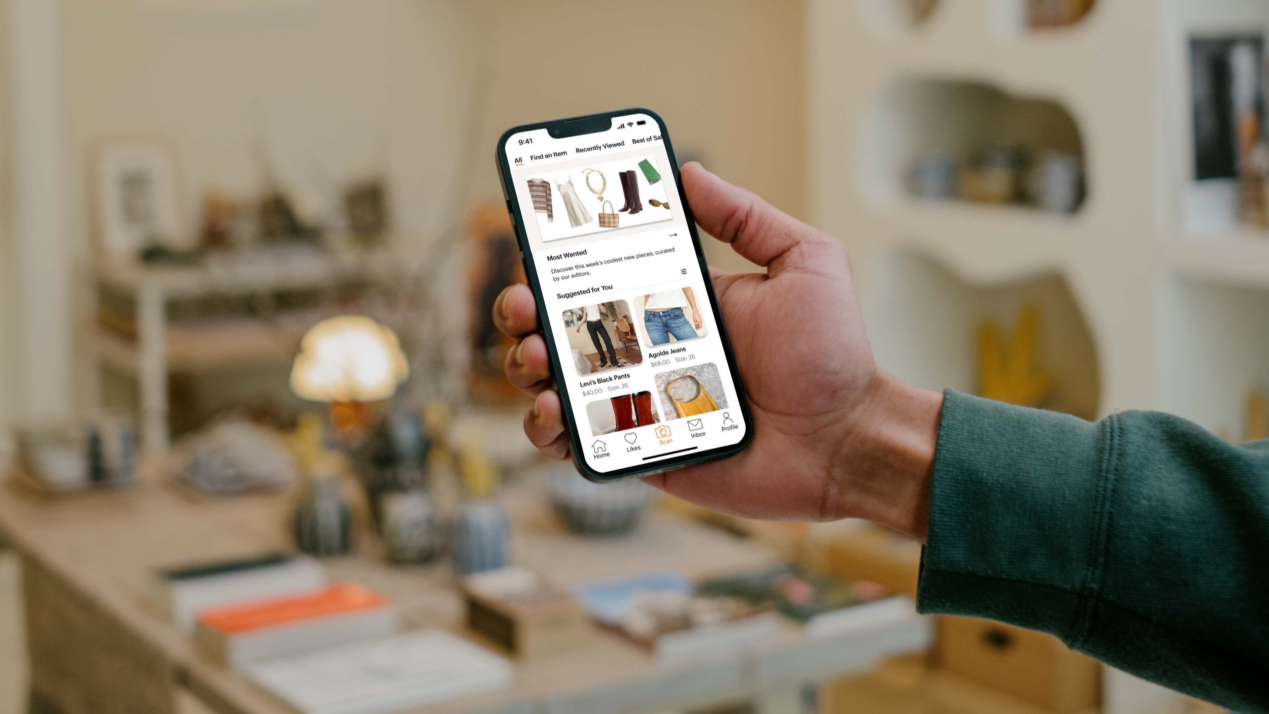
Users will have Scout It readily available on their mobile device when shopping and it will be a delight to use.