
United Airlines In-Flight Entertainment Redesign
Most in-flight entertainment systems are outdated and lack advanced technology that would be helpful for passengers.
The United Airlines in-flight entertainment redesign creates a functional, well-designed in-flight entertainment system to help travelers relax for their upcoming trip.
Description: In- Flight Entertainment Redesign
Role: UX/UI Designer, Researcher
Duration: 8 weeks
Software: Figma, Miro, Photoshop

The Problem
Lack of Entertainment Options
Airline travelers often rely on in-flight systems to satisfy their entertainment needs during a flight. Passengers enjoy watching movies, ordering food, playing games, among other activities to preoccupy themselves.
Mobile Device Integration
The Solution
The United Airlines flight entertainment redesign creates a better experience for passengers by allowing them to connect to their own devices and explore new features.
The Main Features
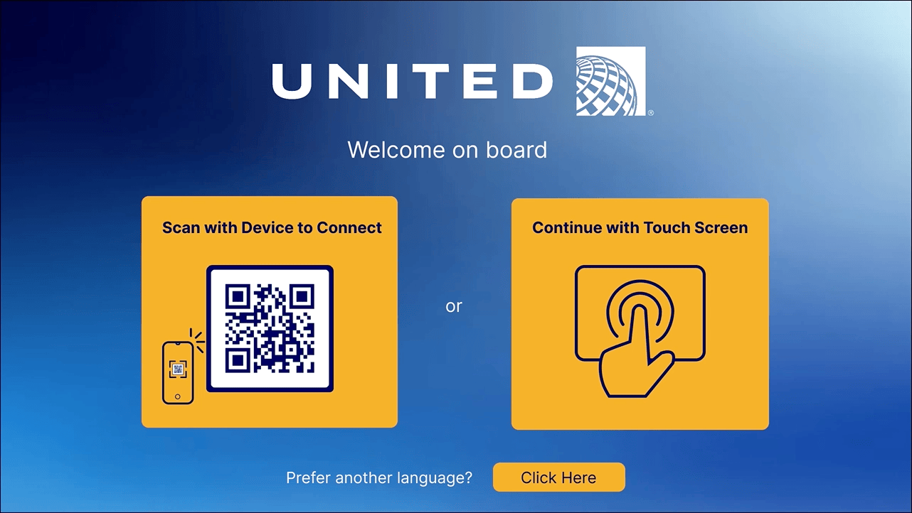
Connect A Device
Tired of the movie options the airlines provide? Simply scan the QR code to watch any movie or show from your own device.
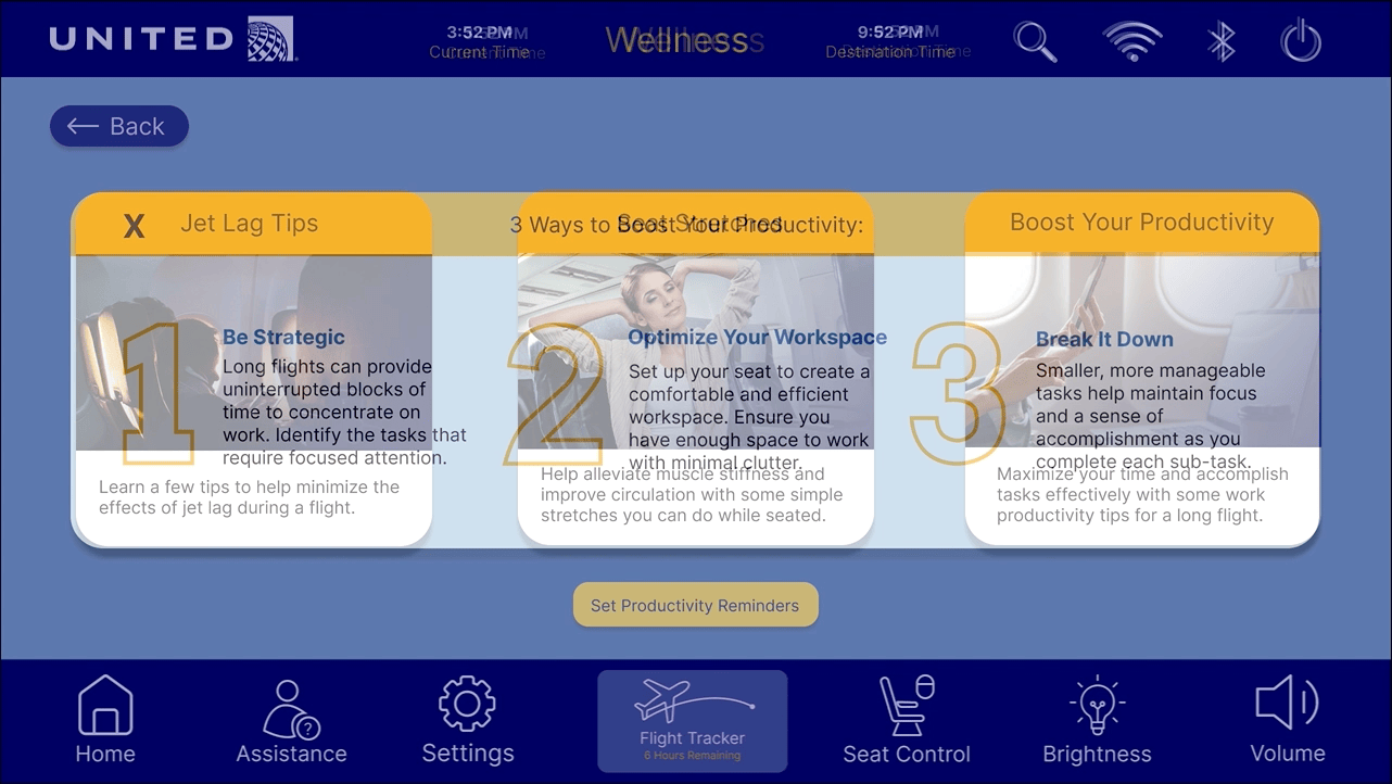
Stay On Task
Find a new wellness category that supports productivity with custom reminders to motivate you to stay on task and take breaks throughout the flight.
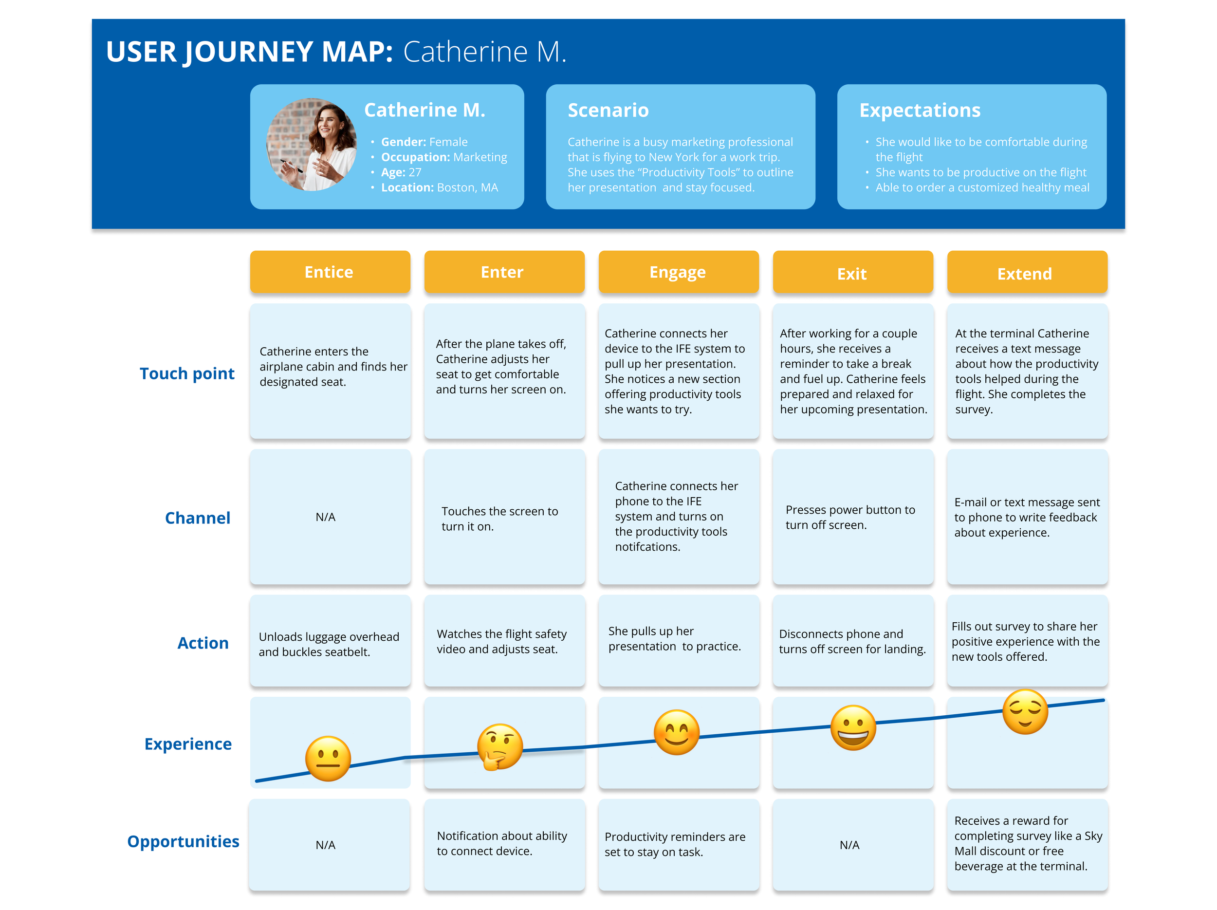
Catherine The Marketing Professional
User Journey Map
My user, Catherine, is based on my survey respondents. I created a short questionnaire for a diverse range of participants regarding their previous flight experiences using an in-flight entertainment system. I found a few common themes from participants' responses such as: lack of movie options, outdated screen displays, and struggling to maintain comfort during the flight.
Identifying Catherine’s career goals and frustrations allowed me to understand potential areas of opportunity and pain points for the in-flight entertainment system as a busy business traveler. She is low on time from frequent travel and wants to excel in her upcoming presentation.
Design System Review
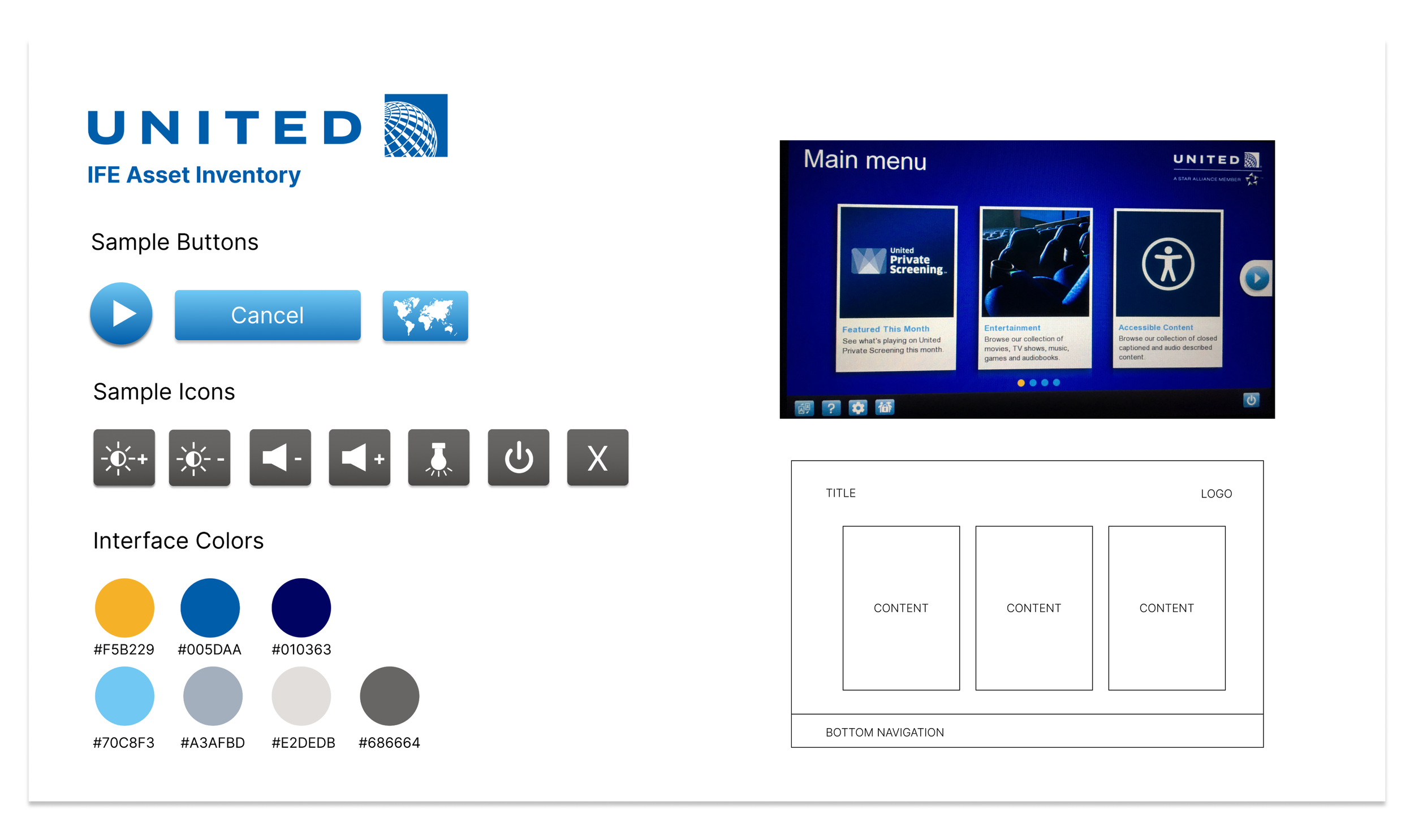
Branding 101
I gathered United Airlines’ asset inventory to help create a mental model of how they organize their entertainment system that I could incorporate into my own design. I examined their branding to identify the styles used in their current system. It became evident that my design solution needed to include clear, distinct tabs for users to engage with the system.
Main Navigation Wireframes
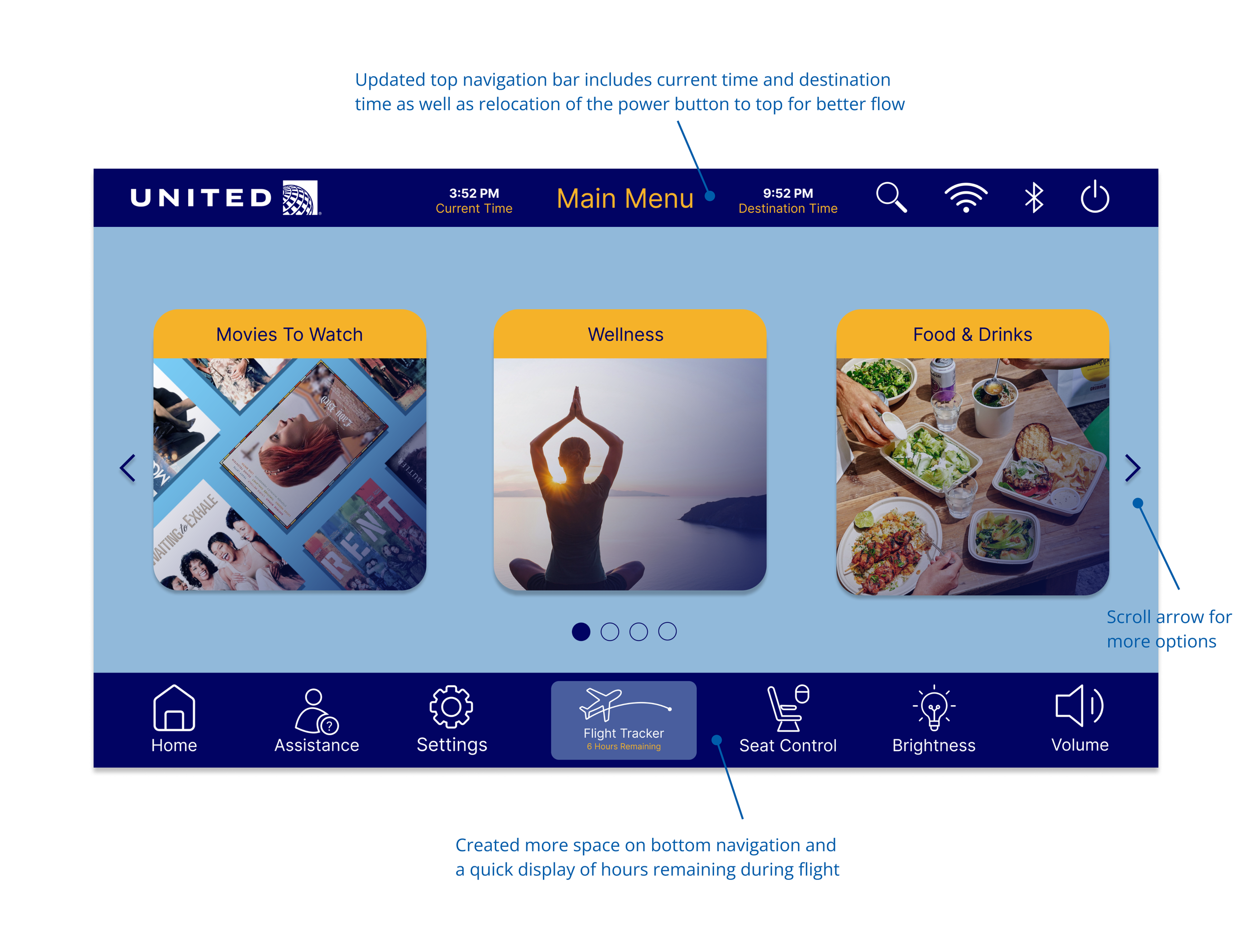
Before and After
I adjusted my designs to include more visuals and less text for the users throughout each page. Additionally, I moved the power button on the bottom navigation to the top right. This decision was made so users would not accidentally press the on/off button when navigating the tools on the bottom.

Takeaways
After completing the redesign of my in-flight entertainment system, I came to a realization that there is immense potential for improvement in these devices. My primary focus was catering to the needs of business travelers, and it became evident that there was a lack of wellness and productivity tools offered in existing systems and device integration for more entertainment options. Thus, my redesign aimed to bridge this gap and address these unmet needs.
If this app were launched today, I would take a closer look at:
Task Success Rate: How many users decided to connect to their own device? How many users utilized other apps to watch movies/tv?
Satisfaction Rate: How many users preferred utilizing their own device vs apps offered by airline?